Shay is a junior at the Academies@Englewood in Englewood, New Jersey. She was born in Shanghai, China and moved to New York City when she was two.
Her interest in photography was inspired by her father, at a young age. Her additional hobbies include snowboarding, painting, playing the piano and attending concerts. She plans on majoring in film production in college. Now, she resides in the in the suburbs, in New Jersey, which relates to her interest in the ironic difference and amalgamation of urban and suburban life.
.
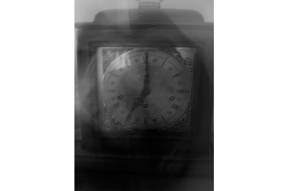
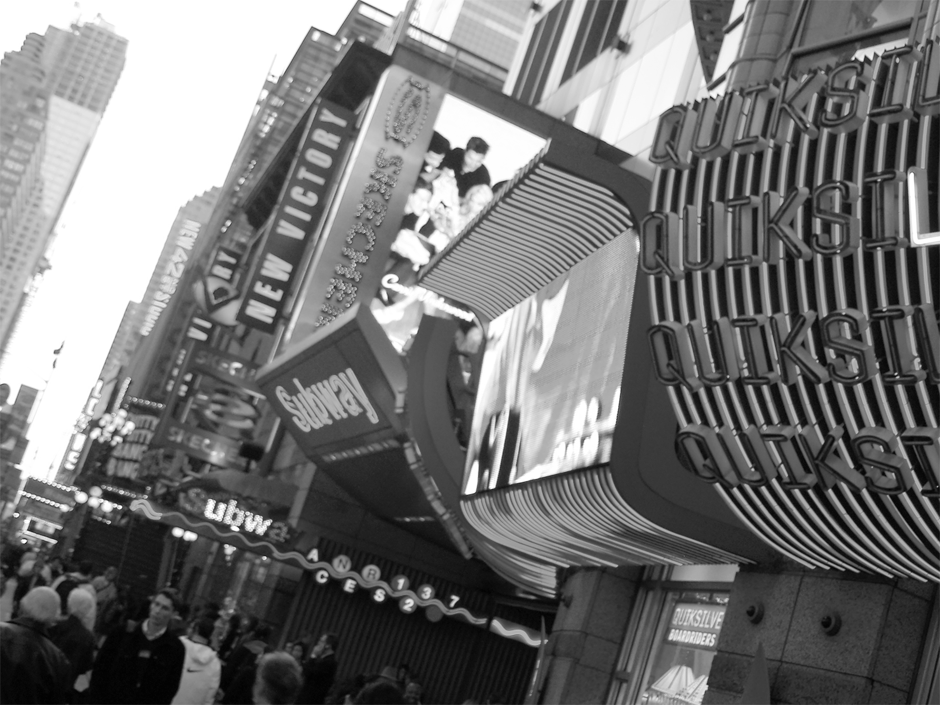
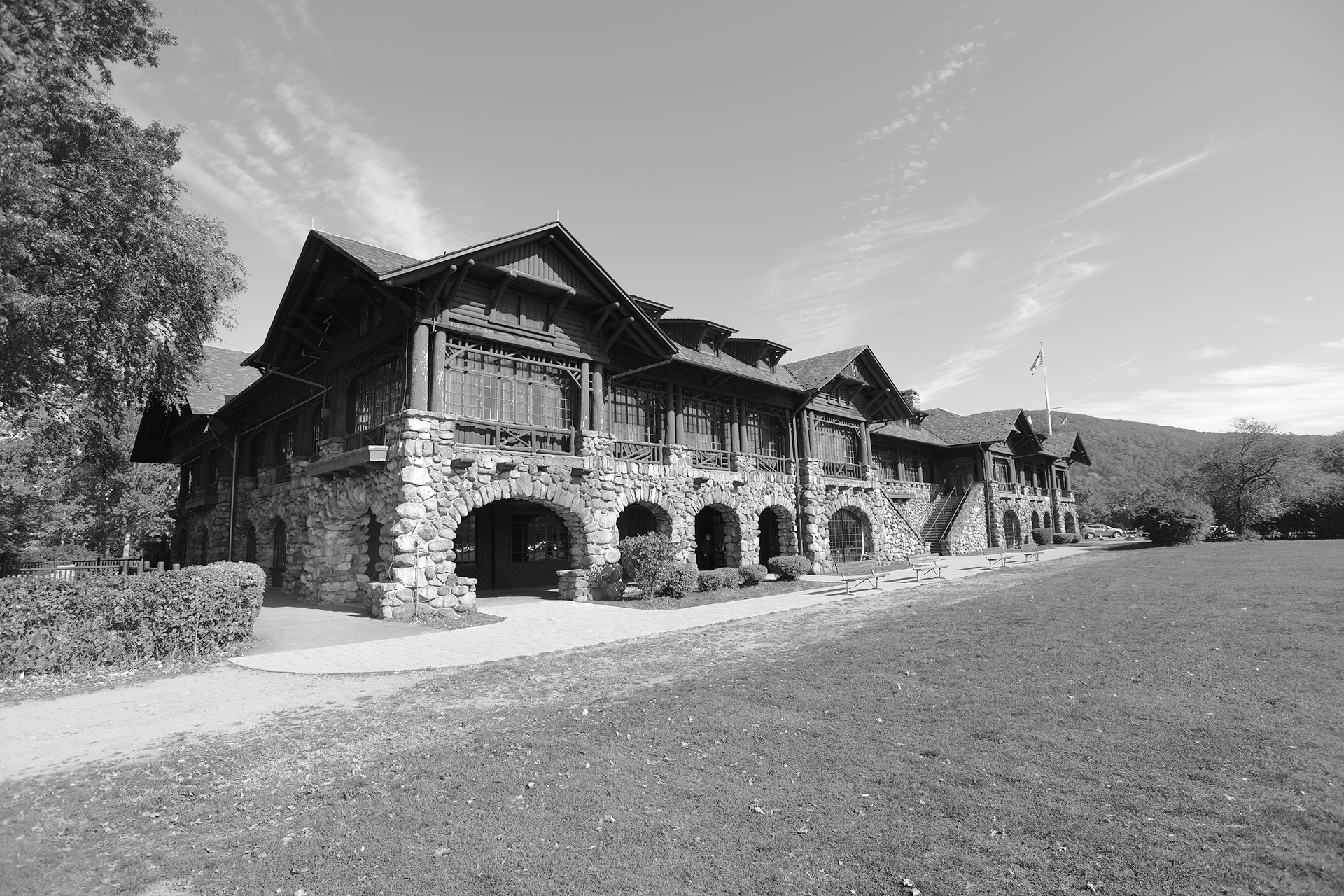
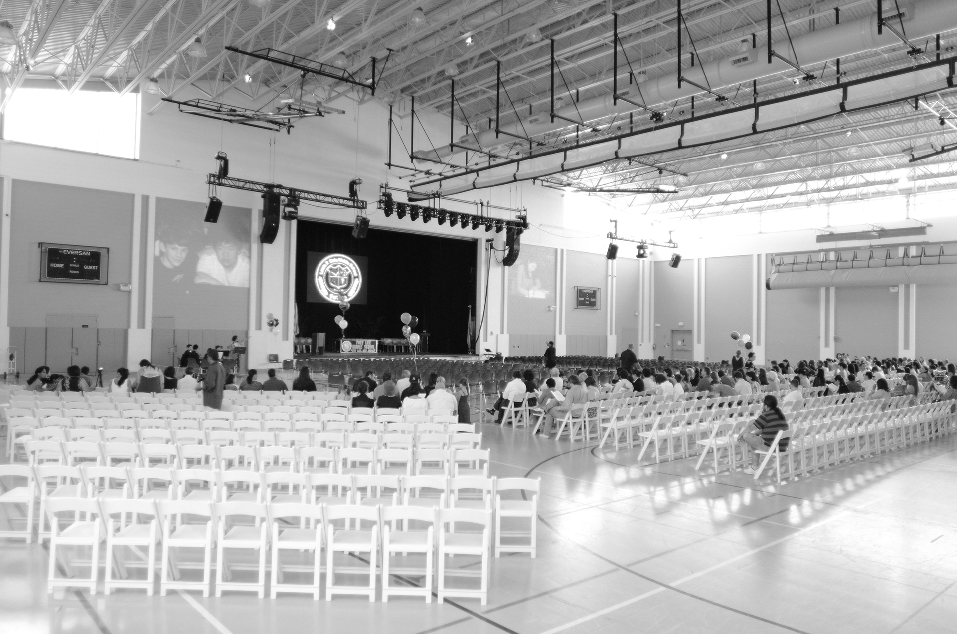
Why do we, as humans, perceive certain colors to mean certain things? We typically see red as danger and passion, yellow as happiness and simplicity, and black as sophistication. Research has shown that certain colors such as red increases the human pulse, causing an increase in adrenaline and more excitement of the brain. Similarly, eye doctors often tell patients to look at green objects after using the computer for long periods of time in order to relax eye muscles. To the human psyche, color is everything and without color, our emotions and reactions no longer function properly. For this series, I took pictures representing the seven colors of the rainbow along with black and white. For example, I used puppies to represent yellow because they are characteristically warm and energetic. For each of these nine colors, a grayscale photo will represent the stereotypical perception of the colors. Red is exciting, orange is cheerful, yellow is energetic, green is relaxing, blue is tranquil, indigo is creative and violet is wealthy. I make all the photos black and white, which immediately takes away a lot of the physical perception behind them. In black and white, the puppies no longer seem so warm, Times Square no longer looks so daring and full of excitement and a middle school graduation no longer holds the same purity as it did in color. To intensify the implications of color behind each black and white photo, I attached a paint sample card of the color that the photo represents, next to the photo, in order to recreate the timeless color perceptions that the photo once held.

